Todd's Creative Fix Example 4 – Web Order Page

Hello Fellow Marketer,

This Before and After is a strategic creative fix of a web order page for a big consumer magazine.

Okay, an ordering device might not be the sexiest part of a marketing campaign, but it’s the critical moment-of-truth in the customer journey...

Strategic Fix 4 of 7 – Web Order Page

BEFORE Todd's Fix
AFTER Todd's Fix

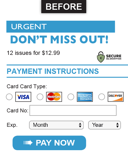
Before: The consumer has clicked to get their “discounted deal” but the old landing page then tries to RE-sell them, and it neglects to mention the discount.

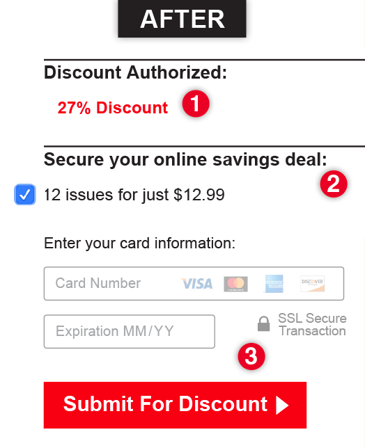
After: 1) Our test (very successful) knows that it’s an order page and steers clear of circus-like fonts and colors. First thing, it confirms their discount. 2) Notice how we manage to avoid the scary “Pay” word. 3) The ‌all-important transaction section is clean and modern with interactive entry fields and a non-hokey security icon treatment. And the button wording conveys a benefit instead of a pirate’s order.

Thanks for having a look.
-Todd

Please share if you like this

LinkedIn Twitter

A Good Deal:  You can now work with a big-ad-agency-in-Manhattan Creative Director (that was me) at not-a-big-ad-agency and no-longer-in-NYC prices. To get in touch:

Todd’s mobile 248-417-1939  and email todd@toddlerneradvertising.com

 See other examples from this series:  1 of 7   2 of 7   3 of 7   4 of 7   5 of 7   6 of 7   7 of 7 

Meet: Butch the Plumber

Todd Lerner Advertising

Todd Lerner Advertising, 2035 Cokers Chapel Rd, Ball Ground, GA 30107