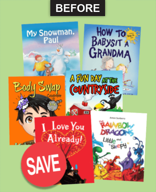
Before: Book pictures in past communications seemed like messy, muddy-looking piles that were tossed into the layout arbitrarily.
After: 1) We developed a modular design grid to make the books look crisp and desirable. Thought was given to the order and positioning to help contrasting colors work together for maximum impact... 2) The covers themselves are vibrant and varied, so our quiet background doesn’t try to compete. 3) We optimized the art so it loads fast but also looks sharp on today’s high-resolution displays.